Healthcare
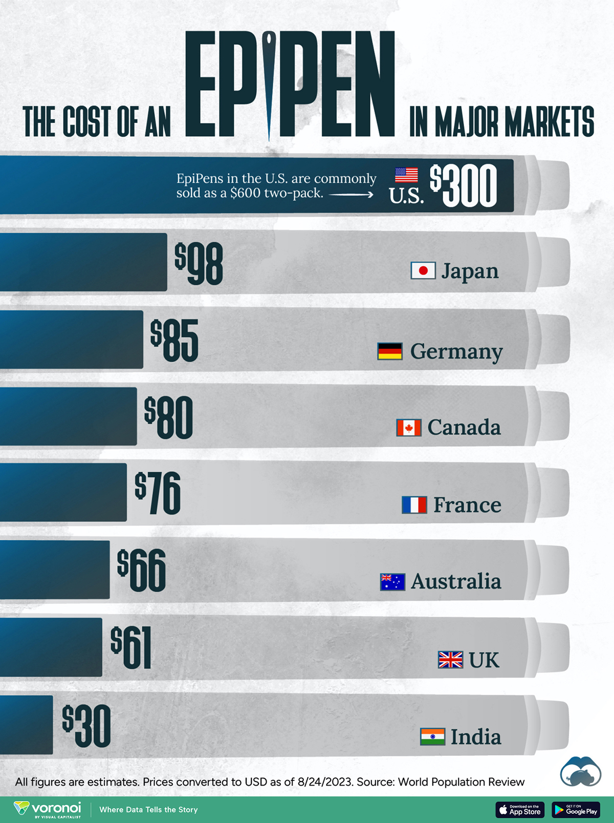
The Cost of an EpiPen in Major Markets
![]() See this visualization first on the Voronoi app.
See this visualization first on the Voronoi app.
The Cost of an EpiPen in Major Markets
This was originally posted on our Voronoi app. Download the app for free on iOS or Android and discover incredible data-driven charts from a variety of trusted sources.
EpiPens are auto-injectors containing epinephrine, a drug that can treat or reverse severe allergic reactions, potentially preventing death.
The global epinephrine market was valued at $1.75 billion in 2022 and is projected to reach $4.08 billion by 2030. North America represents over 60% of the market.
EpiPens, however, can be prohibitively expensive in some regions.
In this graphic, we present estimated EpiPen prices in major global markets, compiled by World Population Review and converted to U.S. dollars as of August 2023.
Why are U.S. Prices so High?
The U.S. stands out as the most expensive market for EpiPens, despite over 1 million Americans having epinephrine prescriptions. After Mylan (now part of Pfizer) acquired the rights to produce EpiPens in the U.S. in 2007, the cost of a two-pack skyrocketed to $600, up from about $60.
| Country | Price (USD) |
|---|---|
| 🇺🇸 U.S. | 300* |
| 🇯🇵 Japan | 98 |
| 🇩🇪 Germany | 85 |
| 🇨🇦 Canada | 80 |
| 🇫🇷 France | 76 |
| 🇦🇺 Australia | 66 |
| 🇬🇧 UK | 61 |
| 🇮🇳 India | 30 |
*Per unit cost. Commonly sold as a two-pack, meaning total cost is equal to $600
Former Mylan CEO Heather Bresch defended the price hikes to Congress, citing minimal profit margins. Mylan eventually settled with the U.S. government for a nine-figure sum.
Notably, EpiPens are available at a fraction of the cost in other developed countries like Japan, Germany, and Canada.
Making EpiPens More Affordable
Efforts to improve EpiPen affordability are underway in several U.S. states. For instance, the Colorado House approved a $60 price cap on epinephrine, now under review by the state Senate.
Similar measures in Rhode Island, Delaware, Missouri, and Vermont aim to ensure insurance coverage for epinephrine, which is not currently mandatory, although most health plans cover it.


Healthcare
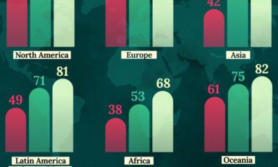
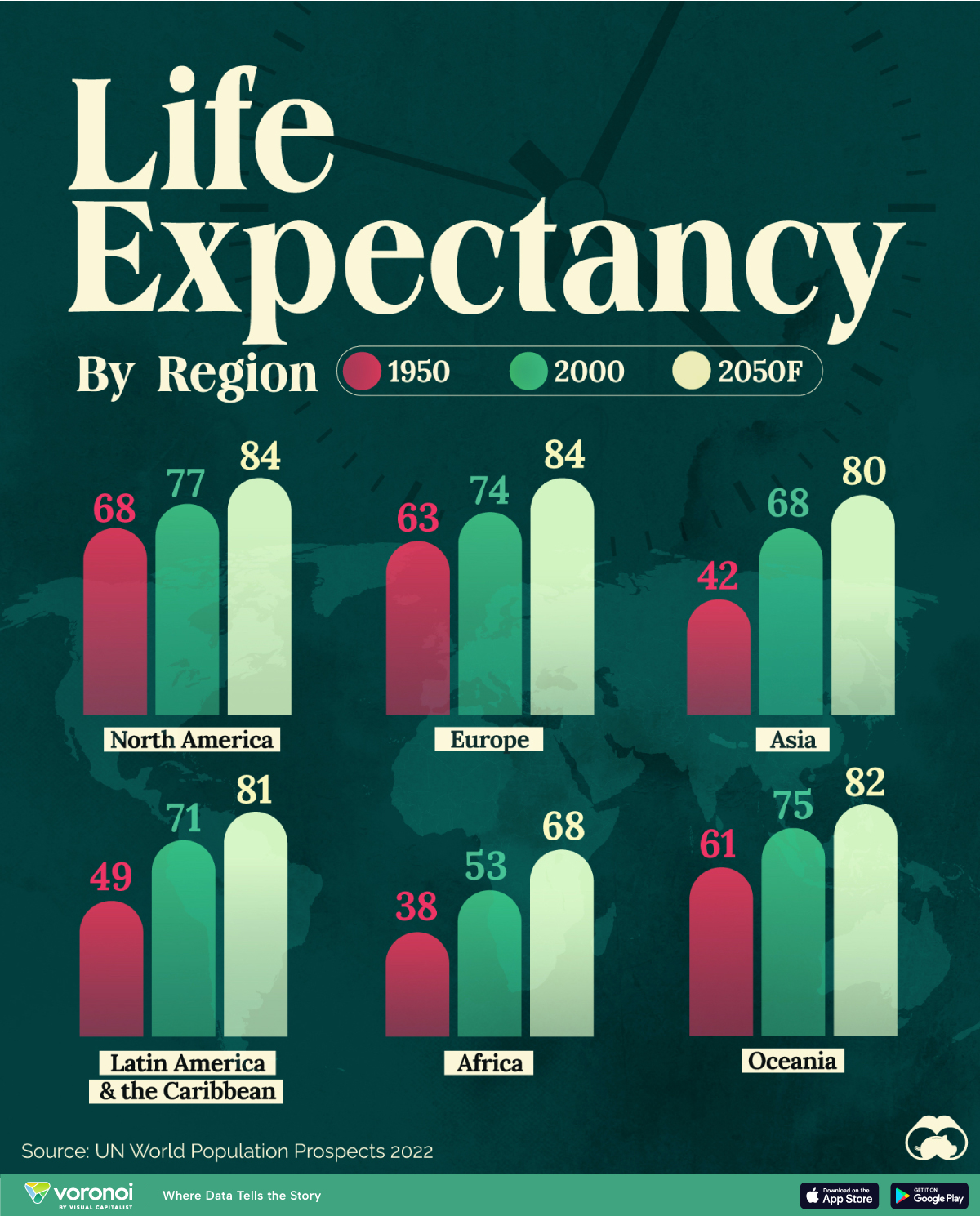
Life Expectancy by Region (1950-2050F)
This map shows life expectancy at birth for key global regions, from 1950 to 2050F.
Mapped: Life Expectancy by Region (1950-2050F)
This was originally posted on our Voronoi app. Download the app for free on iOS or Android and discover incredible data-driven charts from a variety of trusted sources.
Average life expectancy at birth is projected to surpass 80 years in most global regions by 2050, according to the UN World Population Prospects 2022.
This infographic illustrates the trajectory of life expectancy at birth for both sexes, comparing data from 1950 and 2000 with the organization’s projections for the year 2050.
Life Expectancy to See Substantial Growth
At the beginning of the 19th century, no country had a life expectancy exceeding 40 years, with much of the global population enduring extreme poverty, limited access to medical care, and a lack of sanitation.
By 1950, newborns in Europe, North America, Oceania, Japan, and parts of South America were seeing life expectancies surpassing 60 years, while in other regions, newborns could only anticipate a lifespan of around 30 years.
For instance, individuals in Norway had a life expectancy of 72 years, while in Mali, it was merely 26 years. On average, Africa had a life expectancy of only 38 years.
Since then, life expectancies have substantially grown worldwide. Notably, between 1950 and 2000, significant progress was observed in Asia and Latin America and the Caribbean.
| Region | 1950 | 2000 | 2050F |
|---|---|---|---|
| North America | 68 | 77 | 84 |
| Latin America & the Caribbean | 49 | 71 | 81 |
| Europe | 63 | 74 | 84 |
| Asia | 42 | 68 | 80 |
| Africa | 38 | 53 | 68 |
| Australia & Oceania | 61 | 75 | 82 |
The improvement in life expectancy can be attributed to various factors such as advancements in medical technology, better healthcare infrastructure, improved sanitation, access to clean water, and increased awareness about health and nutrition.
In Perspective With History
Although today it seems like rising life expectancy is a given, for much of history it’s worth noting that the situation was much more static.
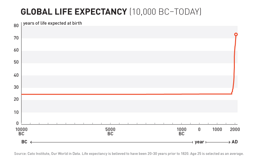
As shown in the above chart, for most of human history life expectancy at birth actually sat in the 20-30 year range. It’s only since the mid-19th century that the aforementioned improvements (sanitation, clean water, etc.) allowed for the exponential and regular progress we see today.

-
 Markets5 days ago
Visualizing Global Inflation Forecasts (2024-2026)
-

 Green2 weeks ago
The Carbon Footprint of Major Travel Methods
-

 United States2 weeks ago
Visualizing the Most Common Pets in the U.S.
-

 Culture2 weeks ago
The World’s Top Media Franchises by All-Time Revenue
-

 voronoi1 week ago
Best Visualizations of April on the Voronoi App
-

 Wealth1 week ago
Charted: Which Country Has the Most Billionaires in 2024?
-

 Business1 week ago
The Top Private Equity Firms by Country
-

 Markets1 week ago
The Best U.S. Companies to Work for According to LinkedIn